The Spa at Muckross
BRANDING / DESIGN FOR WEB / DIGITAL
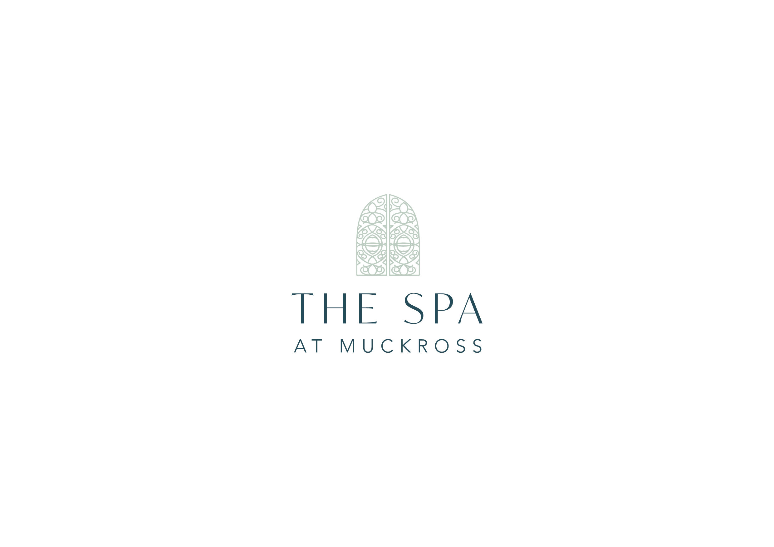
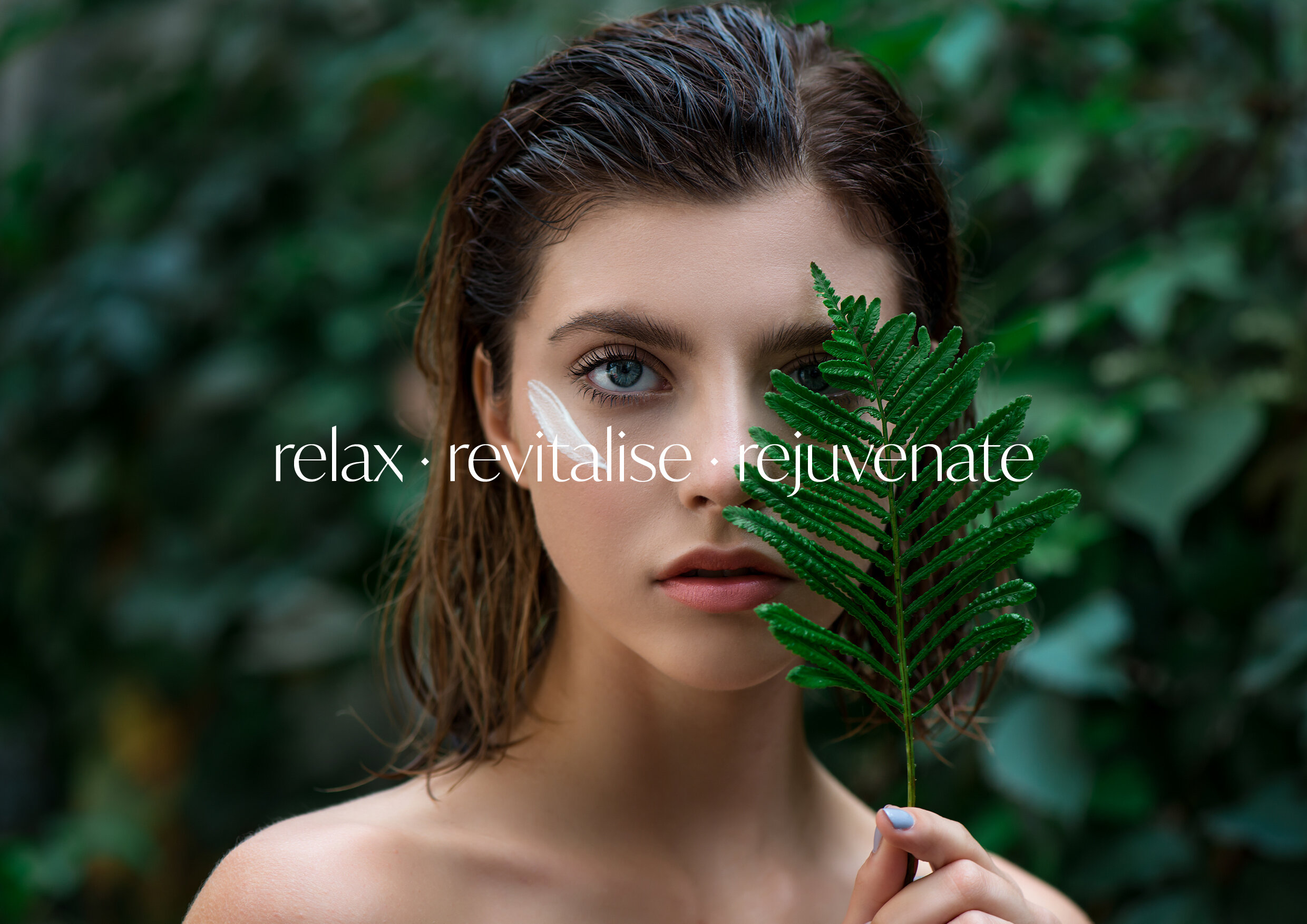
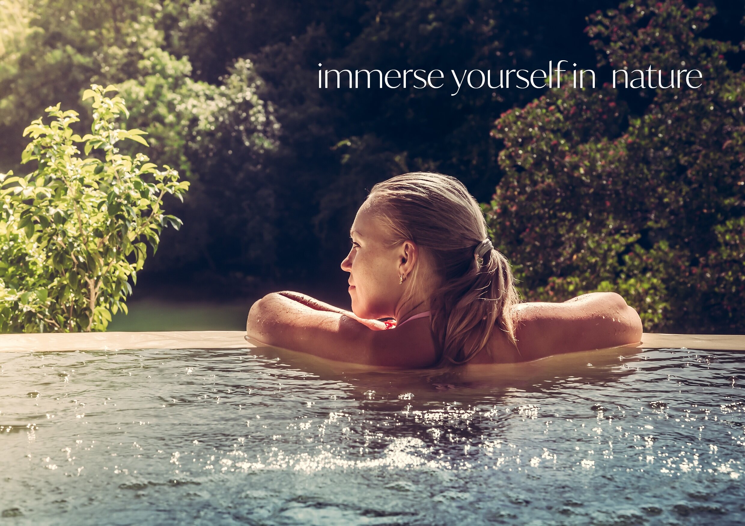
We were asked to refresh the brand identity for ’The Spa’ at Muckross Park Hotel. Their existing branding was already well recognised by the distinctive door design in the logo - which represents the entrance door to the spa, so we knew it was important to retain this feature. The door icon remained, and we brought a new lease of life to the brand by evolving their colour palette and selecting a really elegant typeface named ‘Ivy Mode’ for the new refreshed branding. As well as this, we created a new tone for the brand by selecting photography and imagery to suit the new evolution of the brand and developed the style guide for their revamped website.
